Designing a series
It’s important that books in a series look like they are part of a set. There are various ways of achieving this, from using the same fonts, colours that harmonise or contrast, or perhaps a particular layout or style of image. It may be one or all of these things and it’s worth bearing in mind when the first is being designed just how the others might work as part of the set.
Here’s an example of a series rebrand I did for Desmond Cory, thriller writer, www.desmondcory.com. The covers needed to really stand out, whilst using key elements that sell thrillers and were also pertinent to the main character (man with fedora hat holding a gun). You’ll notice there’s an impressionistic, atmospheric look to all of these covers with the backgrounds giving indicative views of London, the Alps and Paris (all settings relevant to each book). A bold 1950s slab-serif typeface gives the books the correct detective, cold war look (think James Bond) with each cover having its own unique colour tint to make it stand out.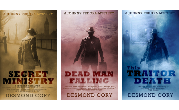 3D Covers
A 3D cover looks really cool on websites and publicity material. I can create you a bespoke 3D cover exactly to your requirements. These range from ebooks, paperbacks or both.
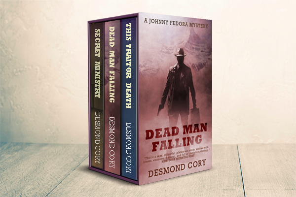
Box Sets
You’ve written a series and you want to market them together in a box set. Again, I can create one for you based on your set. One thing you need to consider is legibility of the wording on the front and spines, because with the distorting of the cover for perspective, you start to loose legibility.
Box Sets appeal to readers because they instantly expect more than one book and they are great value for money.