The way each designer works will be slightly different, but here I’ll give you an overview on the general process I work through with authors so you have an idea. Gary had a specific idea for what he wanted on his cover. Some authors do, most don’t. He supplied his blurb together with a drawing he had done.
As can be seen from the drawing that Gary emailed, he had a good idea about what he was looking for. His book is set in the future – in a space station with parts of the story set on a dystopian Earth that has stopped rotating. Half the Earth is a fiery desert and the opposite half is frozen in a perpetual night. On the space station, humans are transitioning to massive three story robot bodies, but these transitions are sometimes interrupted by demons who take the bodies (think The Exorcist, Paranormal Activity, The Conjuring). The creatures “diems” (as they’re called) are frighteningly devil-like.
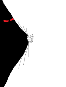
Gary’s idea for the cover is a “typical” space or Earth (fiery or frozen) scene, yet the page is being torn back with robotic talon-like fingers and menacing eyes of a diem from behind in the dark.
I doubted the idea of “the page being torn back with only robotic talons” would work on the limited space of a book cover; but I could incorporate the ‘diem’ figure into the background of the space or Earth (fiery or frozen) scene with a space station in the foreground. Gary was happy with my suggestion and was totally open to creativity with the size of the images, font, title placement and background.
From there I set about sourcing images, which would work on the cover. We needed a demonic and menacing looking character, almost fantasy looking, that would blend into the background. Here are some of the images I found. They are all low resolution shutterstock images with the watermarks removed.
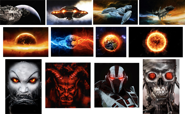
I narrowed down the images to a few I felt would really work which included a spaceship, burning world and demonic figure. From there I had to tweak the colours and match and merge the images together using Photoshop. Gary was quite clear about what he wanted and I thought his concept good. You’ll notice the fonts fit with the futuristic sci-fi genre. I then composed these images and emailed Gary two low-resolution covers.
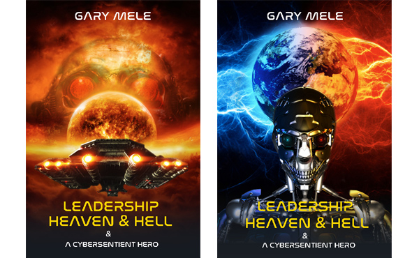
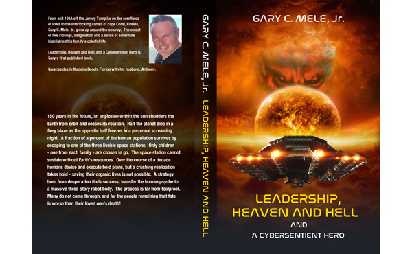
Cover 1: A space station heading towards a dystopian Earth that has stopped rotating with the fiery side facing towards us. The menacing presence of a “diem” (as they’re called), which is frighteningly devil-like appears behind the burning planet.
Cover 2: A dystopian Earth that has stopped rotating with half a fiery desert (the orange side) and the opposite half frozen in a perpetual night (the blue side). In the foreground we see the figure of the hulking frame of a massive cybersentient form – the only hope for survival for the human race.
Gary was happy with visual (1) but made the following request:
Now the first one I like a lot. You did an amazing job with the space station – very happy with it! I like the diem in the background behind Earth, but I’d like  you to tweek the image a bit. The eyes need to be more angry. Don’t know how to put into words exactly – like the eyebrow more forrowed, like this (see image).
Based on Gary’s feedback I then tweaked the visuals further. I downloaded the high-resolution images, and Photoshopped them, blending layers into a cohesive whole. This is the point where I really start to tweak and make subtle variations until the author is happy with the final cover.
Once Gary was happy with the final cover, I mocked up the paperback visual which included a spine and back cover using the blurb and mug shot provided. There were more steps and more emails back and forth in-between but essentially this is the process. Some covers take longer than others, some require more visuals, some less. It depends on the author and the cover.
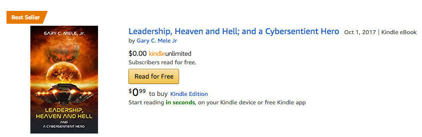
Gary was keen to use the cover for his upcoming book promotion and although I can’t claim that the cover was the sole reason for his book reaching the bestseller list, I’m pretty confident that it formed an important part of its overall success.